Archive for the ‘Joakim Soria’ Tag
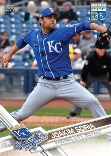
Joakim Soria 2017 Royals Spring Training custom card Leave a comment
Joakim Soria 2016 Spring Training Kansas City Royals custom card Leave a comment

Joakim Soria 2016 Spring Training Kansas City Royals custom card Leave a comment

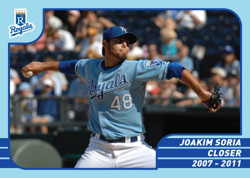
36 Greatest Royals of all-time: Joakim Soria Leave a comment
Joakim Soria’s stay in Kansas City was ultimately short but he still had a huge impact on not so great teams. He was the third really dominant closer Kansas City has had and for about three years was a premier closer in the American League. It is sad to see him get injured and move to Texas but I wish him nothing but the best. He made two all-star teams for the Royals (2008, 2010) and amassed 160 saves while in Kansas City with a 2.40 ERA.
Complete List of Kansas City Royals Bobbleheads Leave a comment
History of Joakim Soria: 1951 Topps 2 comments

1951 Topps is significant to my History of Joakim Soria project for a couple reasons. First, it is the very first year Topps put out a card… there is no 1950 Topps. They weren’t exactly the as other Topps years either. They had rounded corners and were shorter than the regular 3.5 inch baseball card that would soon become common. It had different baseball results so they could be played like a card game. I chose “Ball” for Joakim Soria because it was one of the first cards I found to use for a template.
Secondly, it is the LAST History of Joakim Soria card. My last post was 2012 Topps and soon after I got the motivation to finish off my complete set! I’m pretty excited about it. I spent about a year and a half (off and on of course) re-creating the Topps cards and have finally finished all 61 years. I think it may be a set like no other. I will continue to post these throughout the season as I still have several left to put up on the site.
History of Joakim Soria: 2012 Topps 2 comments
So its been a long while with activity on this website. I’d planned on keeping up my torrid pace by posting football cards during the baseball off-season but I quickly found that my love for football pales in comparison for my love of baseball. I lost interest quickly. February brings a couple things baseball back; pitcher and catchers report to spring training to officially get things started and Topps releases their new line of baseball cards.
With 2012 Topps the Royals got 11 base set players included so it was a little fodder to get me pumped up for the season. The design gets low grades from me. It isn’t horrible but I don’t have a lot to say about it that is good. It is bare-bones Topps. A lot of room for picture is always nice but it is straight out boring other than that. Topps cards almost always grow on me so in July I may rave about the 2012 set, I don’t know yet. Since Joakim Soria was once again not included in the series 1 set it gave me an opportunity to make my card first again, like last year.
I’m hoping this will ignite my fire for custom baseball cards again. It will happen… it is just a matter of time. It has been a crazy and traumatic off-season for me personally so I’m ready to start to concentrate on something I love again. There have not been many great days for me since the Royals last played a game so I’m very much looking forward to watching them again. So here is the 2012 Topps custom card of Joakim Soria. May this the beginning of a great season…

History of Joakim Soria: 1998 Topps 2 comments

“The History of Joakim Soria” is back with another one of the cards from the bland years of Topps. In the late 1990s and early 2000s it seemed Topps was in a bit of a rut. They weren’t cranking out bad designs, just a little bland and not very unique. You can see on this 1998 card the addition of transparent borders to try to liven the card up, what it does is make it busy and distracts from the picture, something I feel you never want to do. The name block has the team’s logo repeated several times in the background, another thing to make the card just look busy. I do like how the actual name of the player runs into the solid box possessing the team’s name though. My last comment; another solid gold border; yuck. Overall, not a good design by Topps.
Most of my re-creations of Topps cards are portrait cards. This one is a landscape card for a couple reasons: I want to represent certain years that did have sideways cards, not all of them did, I don’t think any base cards were sideways from 1972 – 1990. The second reason is some designs look nice in a landscape format. The last reason is simply I have pictures that won’t fit “up and down” on a card like this one.
History of Joakim Soria: 1964 Topps 1 comment
 I’ll just throw it out there right away; I think I nailed this one. It’s odd that the look of certain years of cards are hard to pin down but I got 1964 Topps here. As always it is pretty much always about the picture. I wanted a good high quality head shot of Soria and to crop it tight. I found a nice picture with a bit of a scowl on his face. I know this is a very basic design but I still think it is one of the better re-creations that I have done. I might have to throw in a few Custom Card of the Day’s in the 1964 format since I like it so much and see if it translates well with other teams.
The design of 1964 is very simple and plain. The one distinct thing about it is that the players head breaks the border of the top of the picture. This helps give the card just enough life to keep it from being boring. In 1964 there were obviously no Royals cards so what I usually do is take a Dodgers card to get my color pallet. The Dodgers have been around forever and they have a similar color pallet as the Royals would have had.
History of Joakim Soria: 1978 Topps Leave a comment
 As the baseball season clock runs out there is sure to be fewer and fewer posts on this site but I plan to try to keep it rolling with projects like these. The History of Joakim Soria has now covered about 30 years so I am over halfway done posting. Today’s victim is 1978 Topps. Like 1971 Topps it is one of the very first cards I ever re-created.
I like the design. It is simple and appealing. It has likely one of the largest areas for uninterrupted picture of any year of Topps. It seems plain in many ways but still looks good. I really like the position in the baseball too, it is a nice touch.
